01 The Goal
Create an intuitive, user-friendly system that boosts efficiency and employee engagement — analyzing Decathlon's recruitment project from the current process to future improvements.
- Analyze the current workflow — from attracting candidates to hiring decisions
- Identify opportunities for profitability, efficiency and automation
- Improve in-store recruitment practices and remove friction points
- Reduce recruitment time by eliminating delays
- Improve the entire process to attract the best talent
02 Research
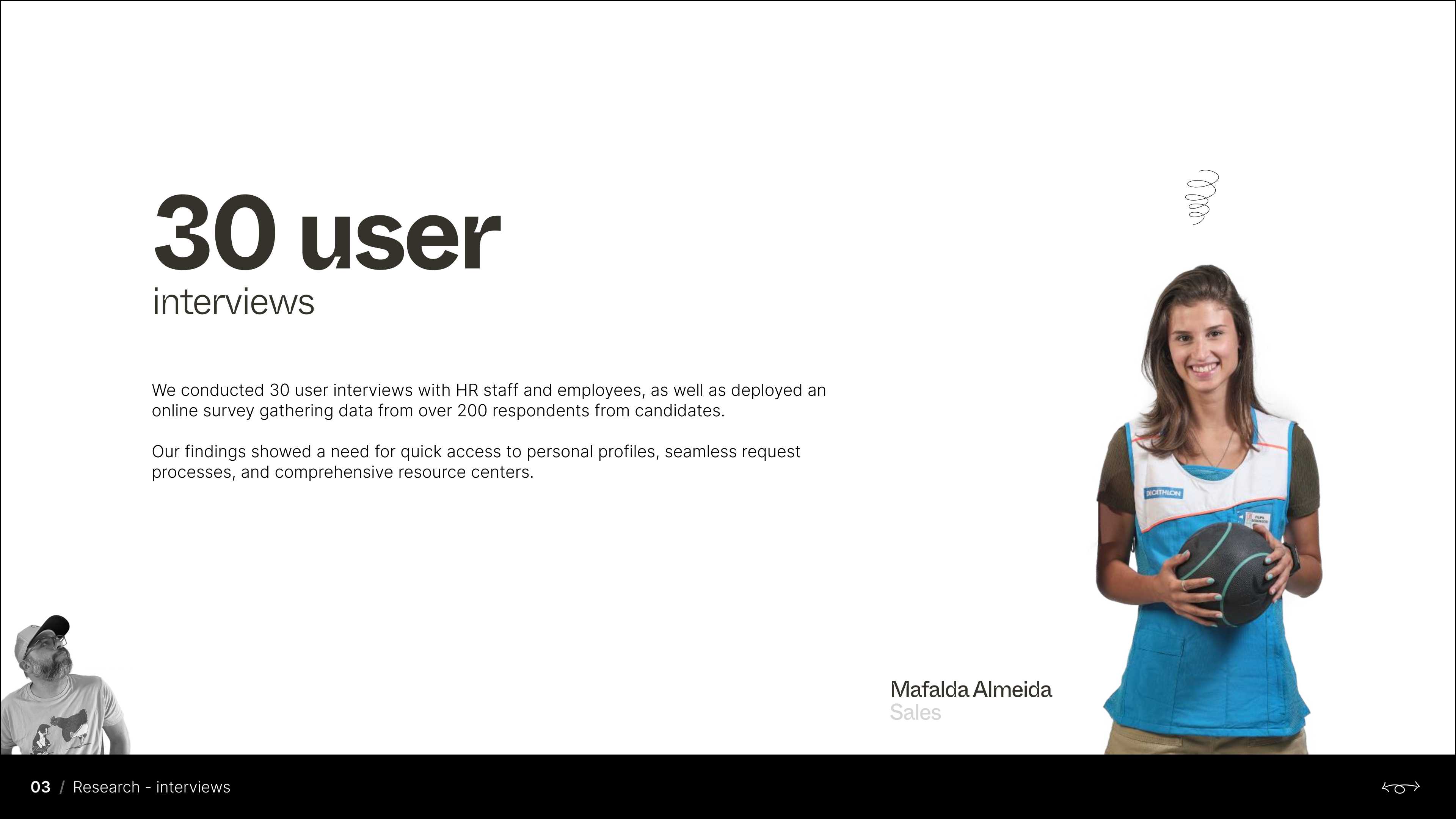
We conducted 30 user interviews with HR staff and employees and deployed an online survey gathering data from 200+ candidate respondents. Findings showed a need for quick access to personal profiles, seamless request processes and comprehensive resource centers.
From the research we shaped 3 personas — HR Manager, Section Manager and Candidate — and ran a competitor analysis (Leroy Merlin, Worten, Sport Zone, Staples…) that revealed a lack of personalized HR platforms in the market, plus usability tests highlighting complex navigation and slow response times as common pain points.
03 Flows & Wireframes
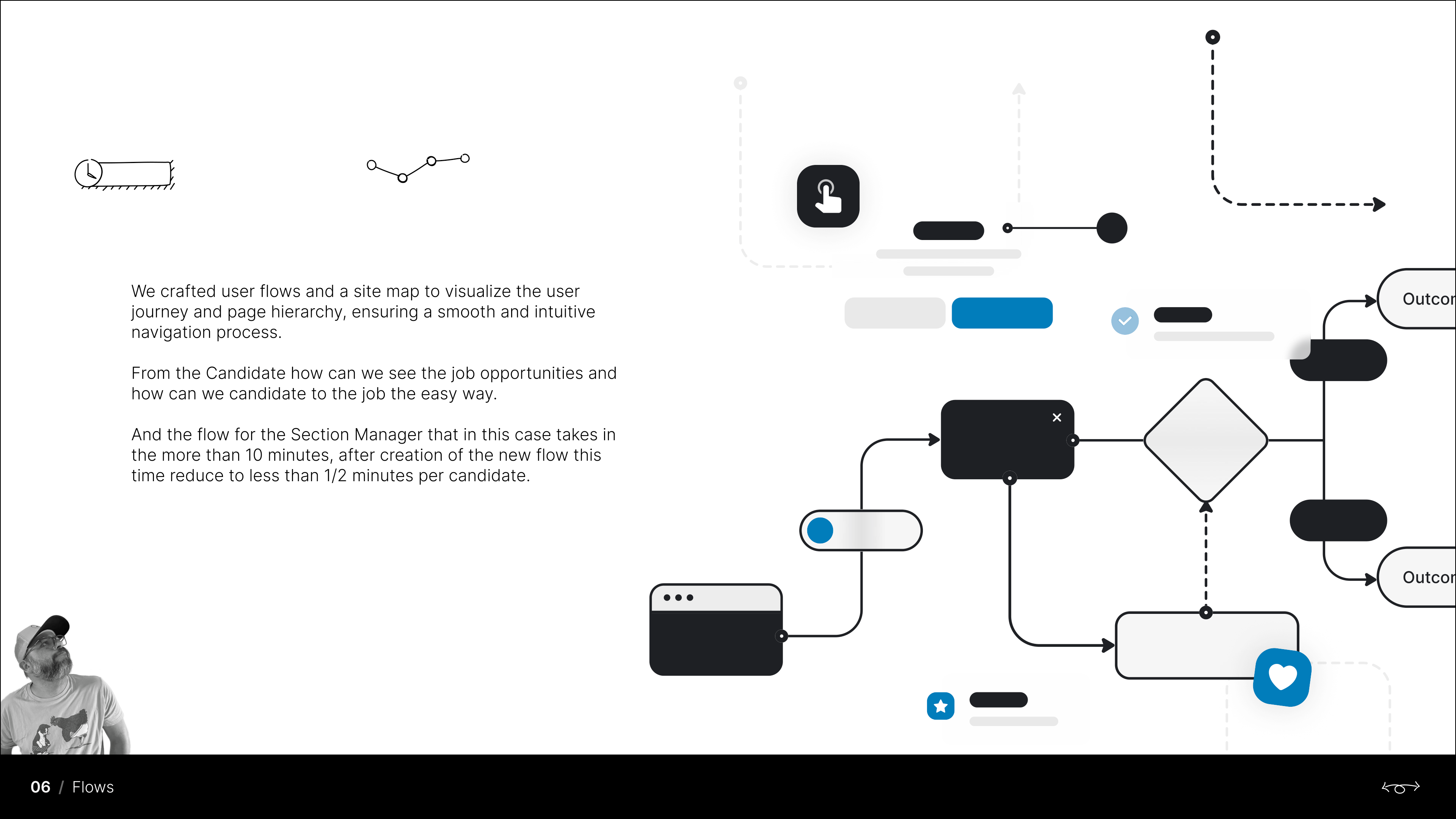
We crafted user flows and a site map to visualize the journey and page hierarchy. The candidate flow makes job opportunities visible and applying effortless; the Section Manager flow — which previously took over 10 minutes — was redesigned to take less than 2 minutes per candidate.
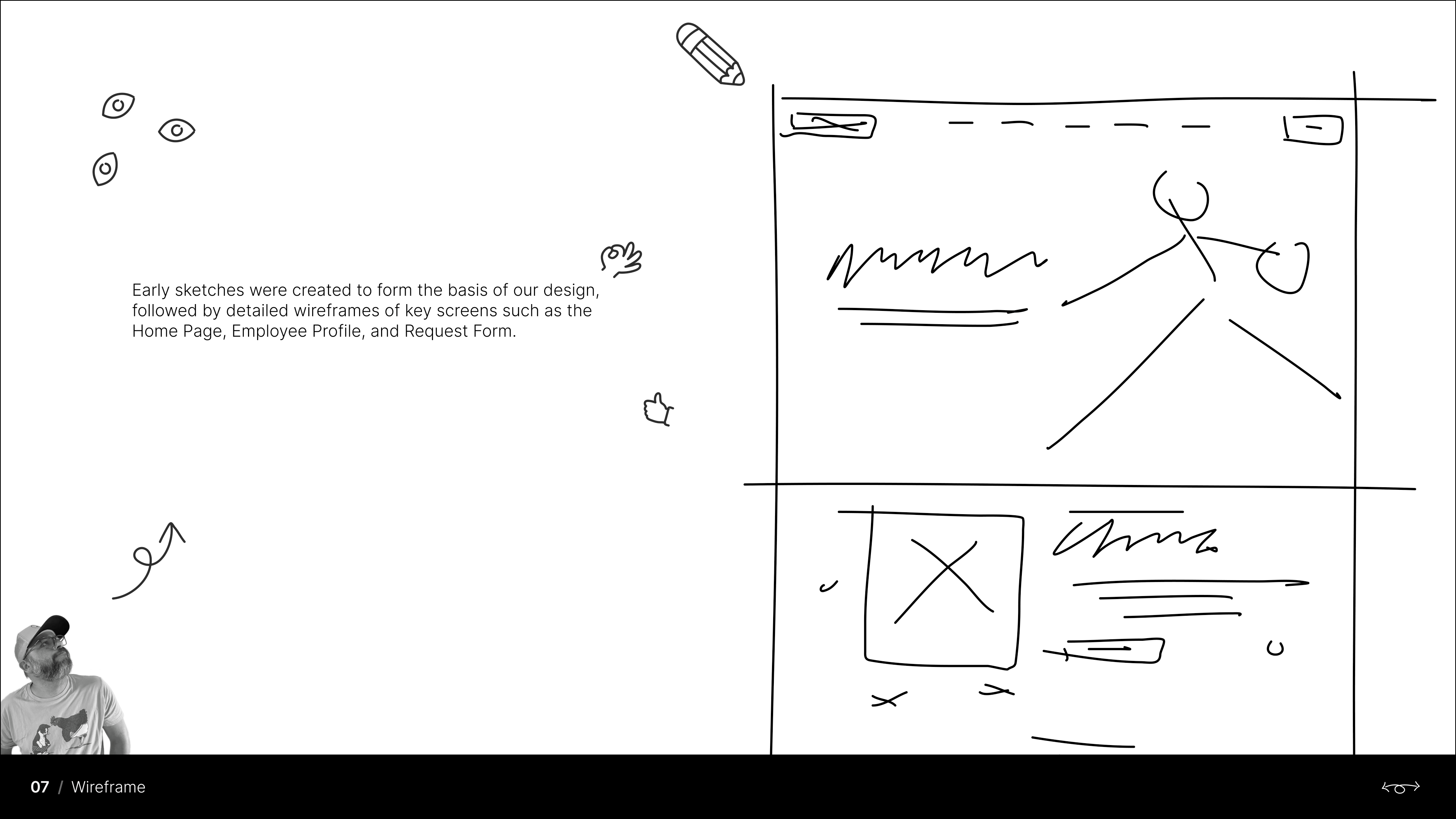
Early sketches formed the basis of the design, followed by detailed wireframes of key screens: Home Page, Employee Profile and Request Form.
04 Design, Prototype & Testing
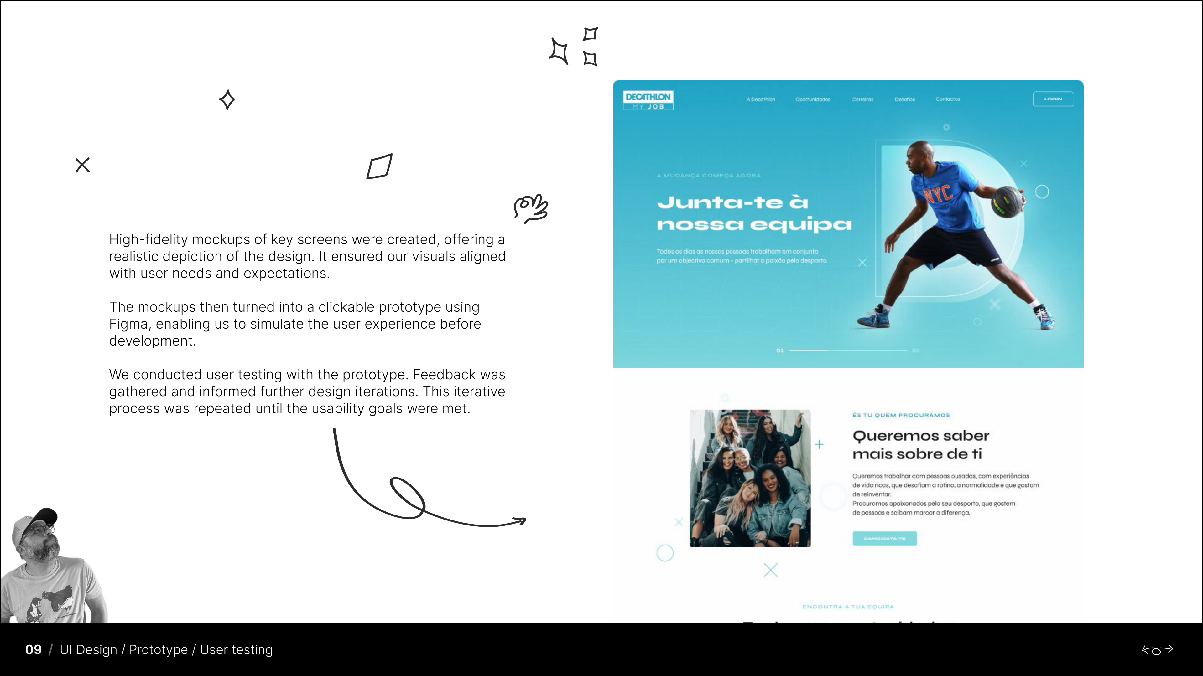
High-fidelity designs built on Decathlon's brand guidelines, focused on usability, accessibility and clear visual hierarchy. The mockups became a clickable Figma prototype, enabling us to simulate the experience before development — and user testing fed an iterative loop that repeated until usability goals were met.
05 The Outcome
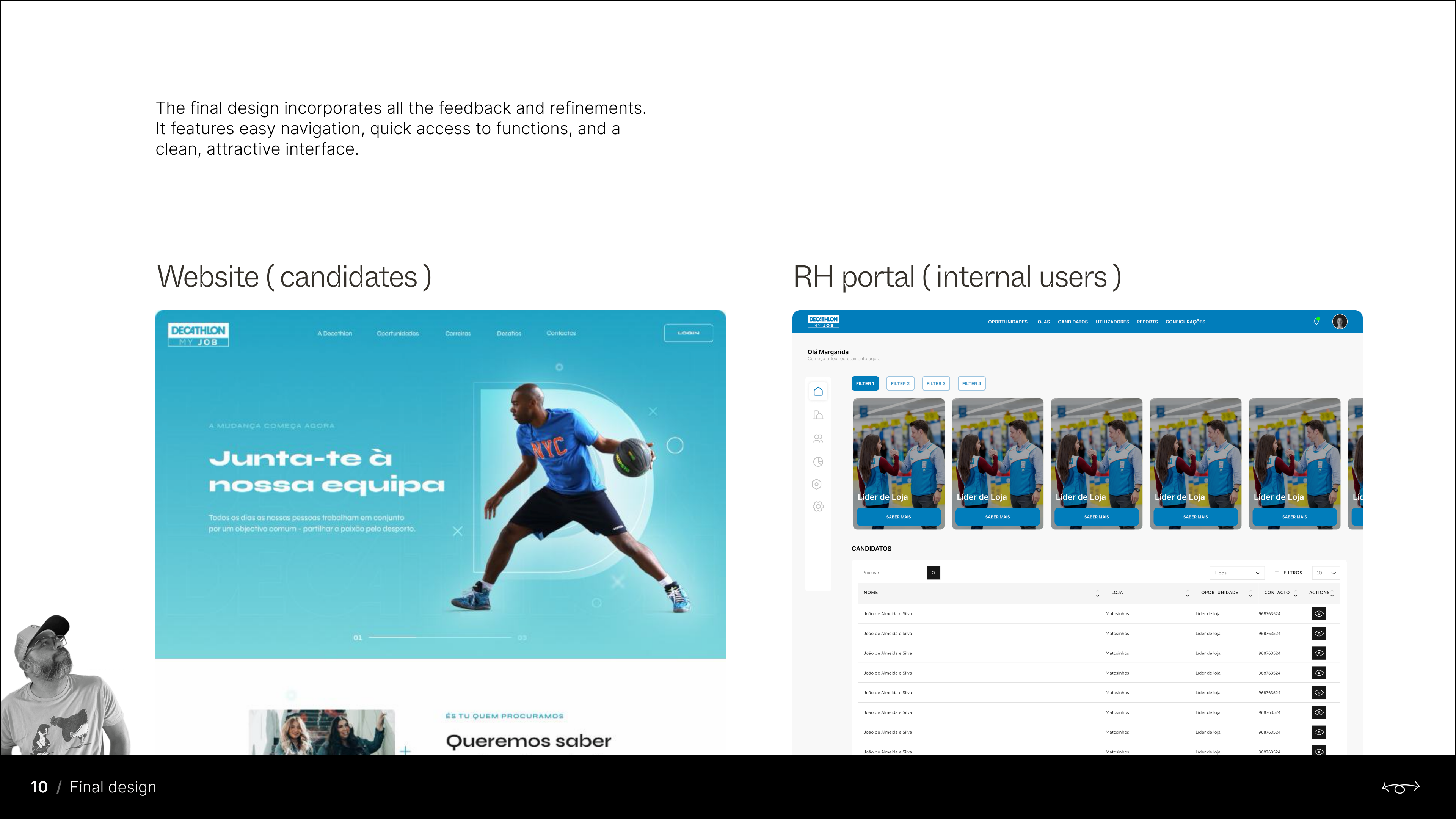
The final design features easy navigation, quick access to functions and a clean, attractive interface — a public recruitment website for candidates and a back-office RH portal for managing opportunities, candidates, users and reports.