01 The Mission
Wella Digital needed a blueprint for designing and building software to support its new digital approach. The goal: a design system promoting consistency, efficiency and clear communication among team members — with particular emphasis on thorough, accessible documentation and a vision of serving multiple teams and brands.
As Design Lead, I managed every layer of the system — foundations, components, patterns, file organization and documentation — while leading the UX/UI team and ensuring brand identity in the digital realm.
02 Organizing the System
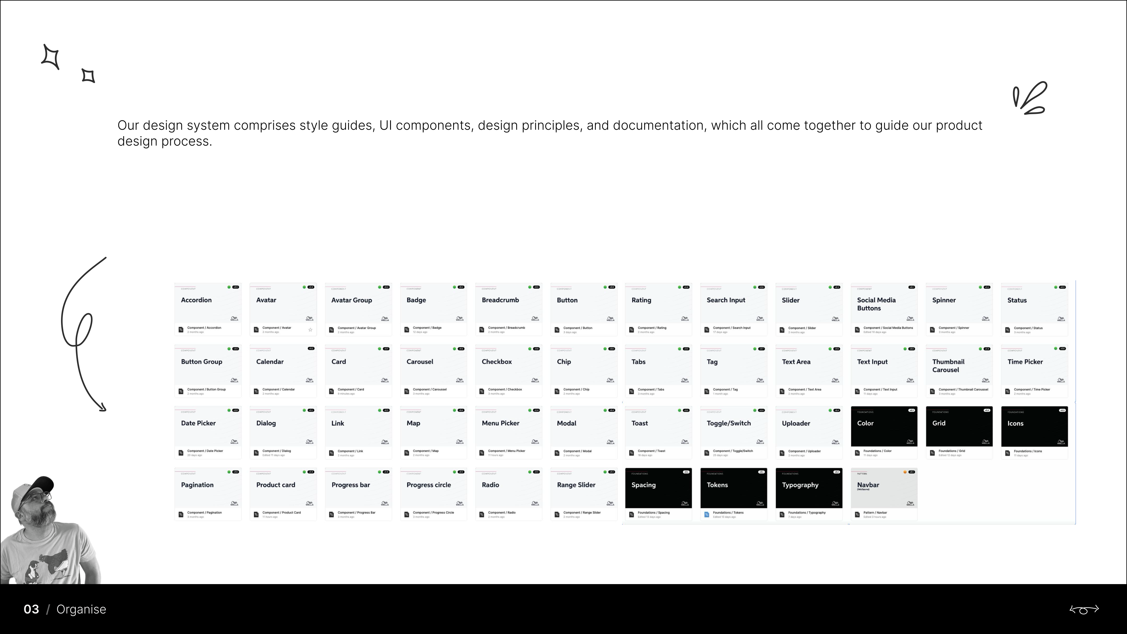
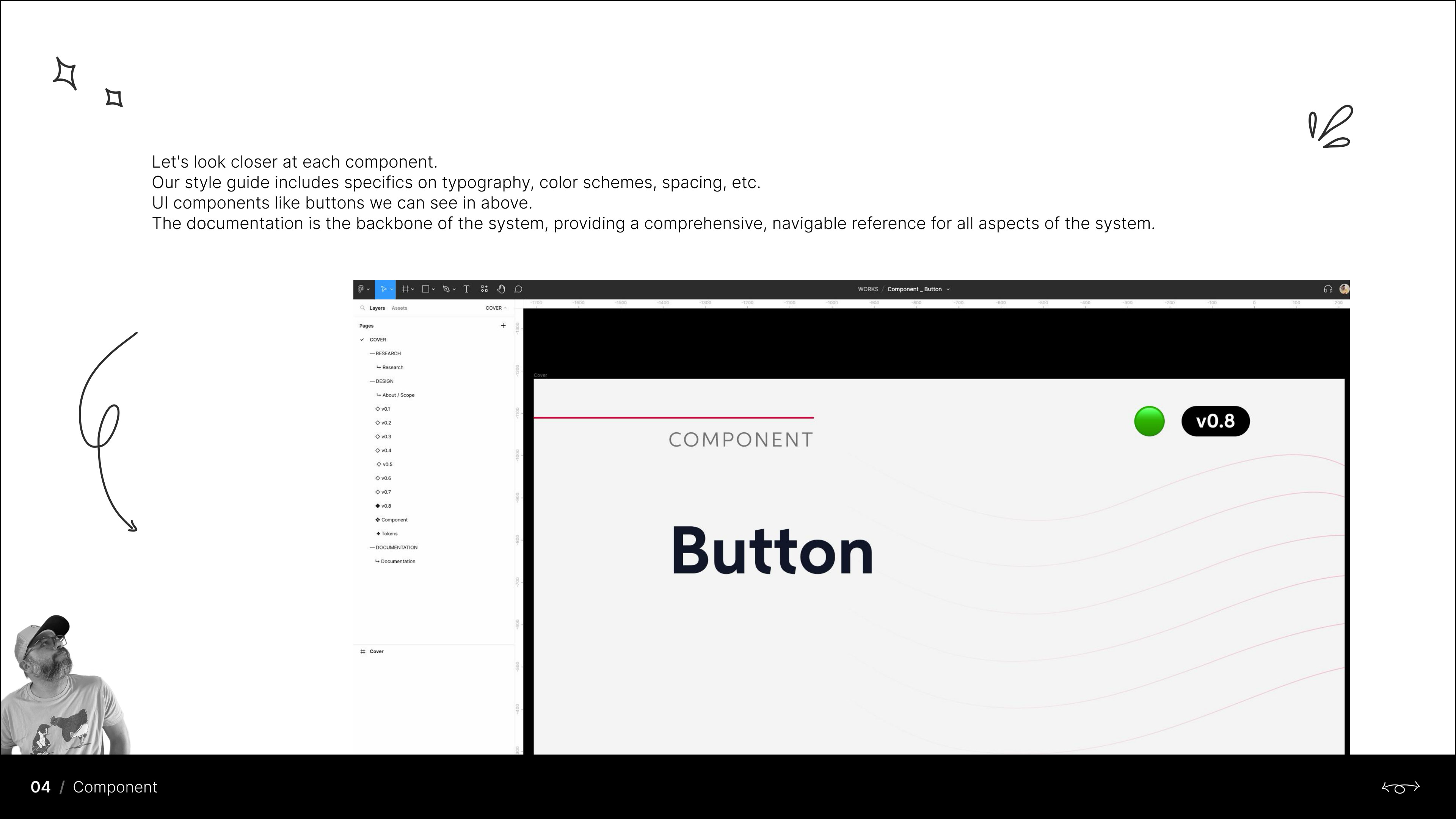
The system comprises style guides, UI components, design principles and documentation — a library of 40+ components, from accordions, buttons and cards to date pickers, modals, navigation and data display, each versioned and documented with a consistent structure: research, design, tokens and documentation.
03 Anatomy of a Component
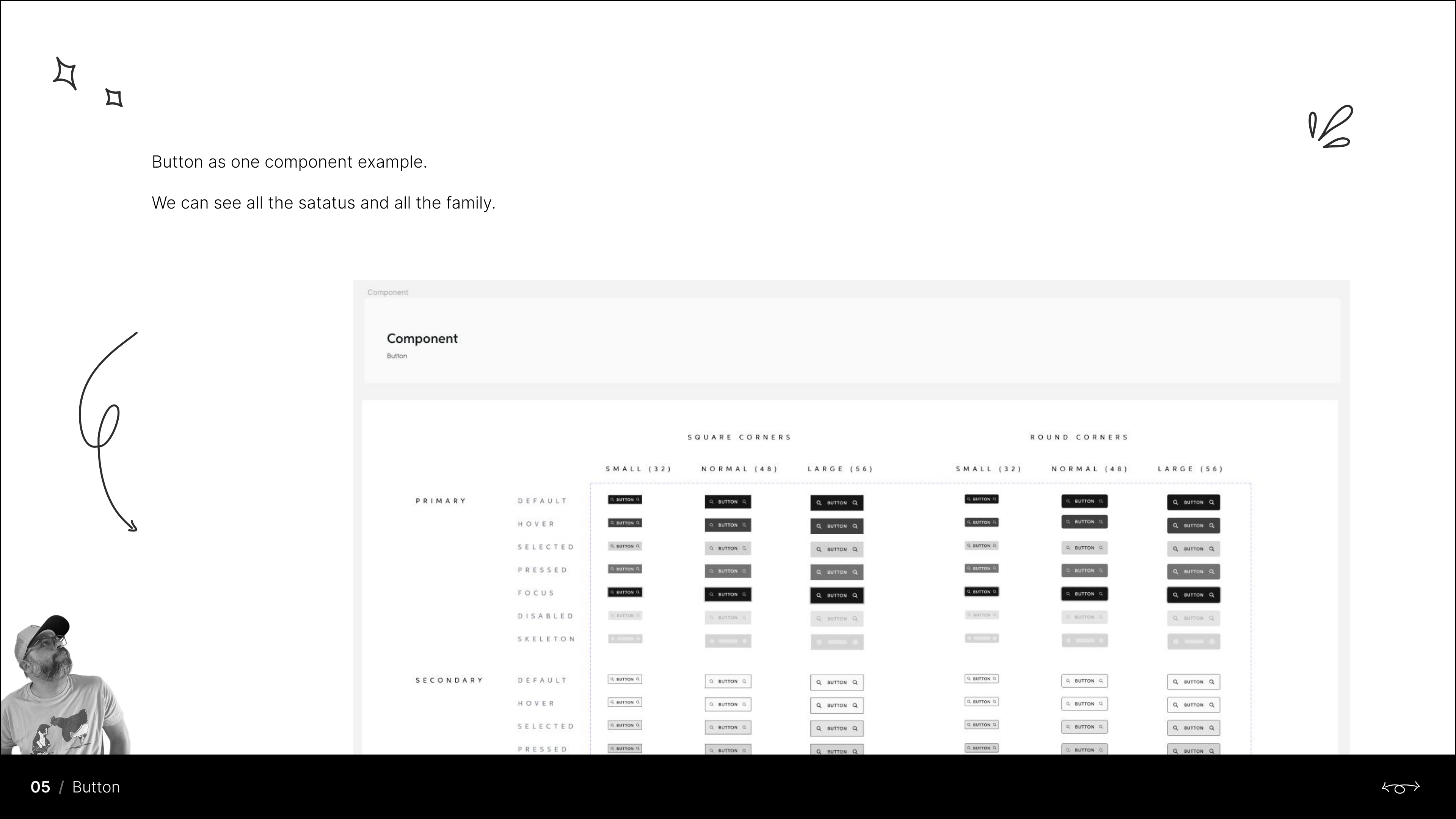
Every component follows the same rigor — the button family alone documents primary and secondary types across seven states (default, hover, selected, pressed, focus, disabled, skeleton), square and round corners, and three sizes with exact measurements.
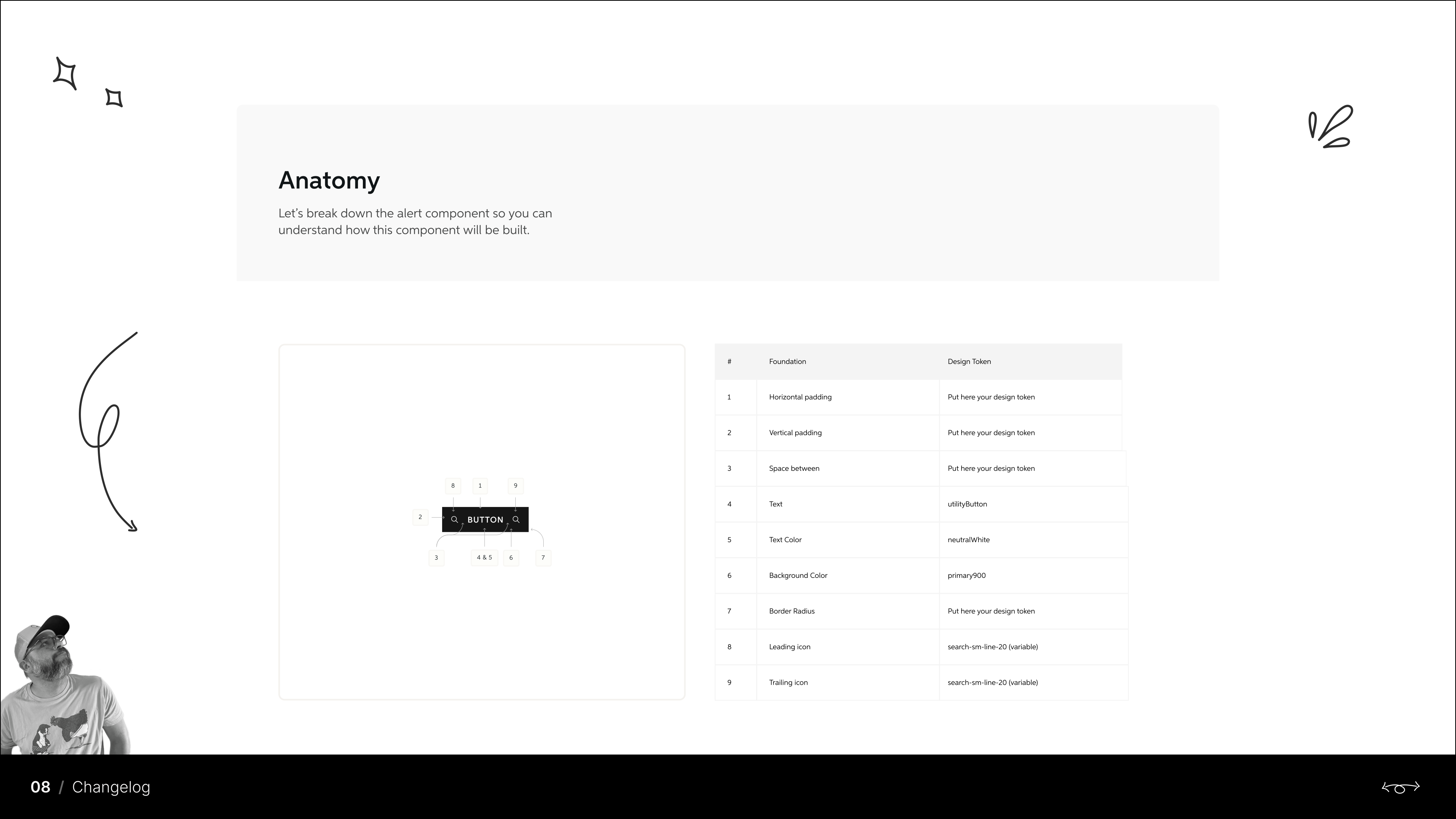
- Anatomy diagrams mapping each part to its foundation and design token
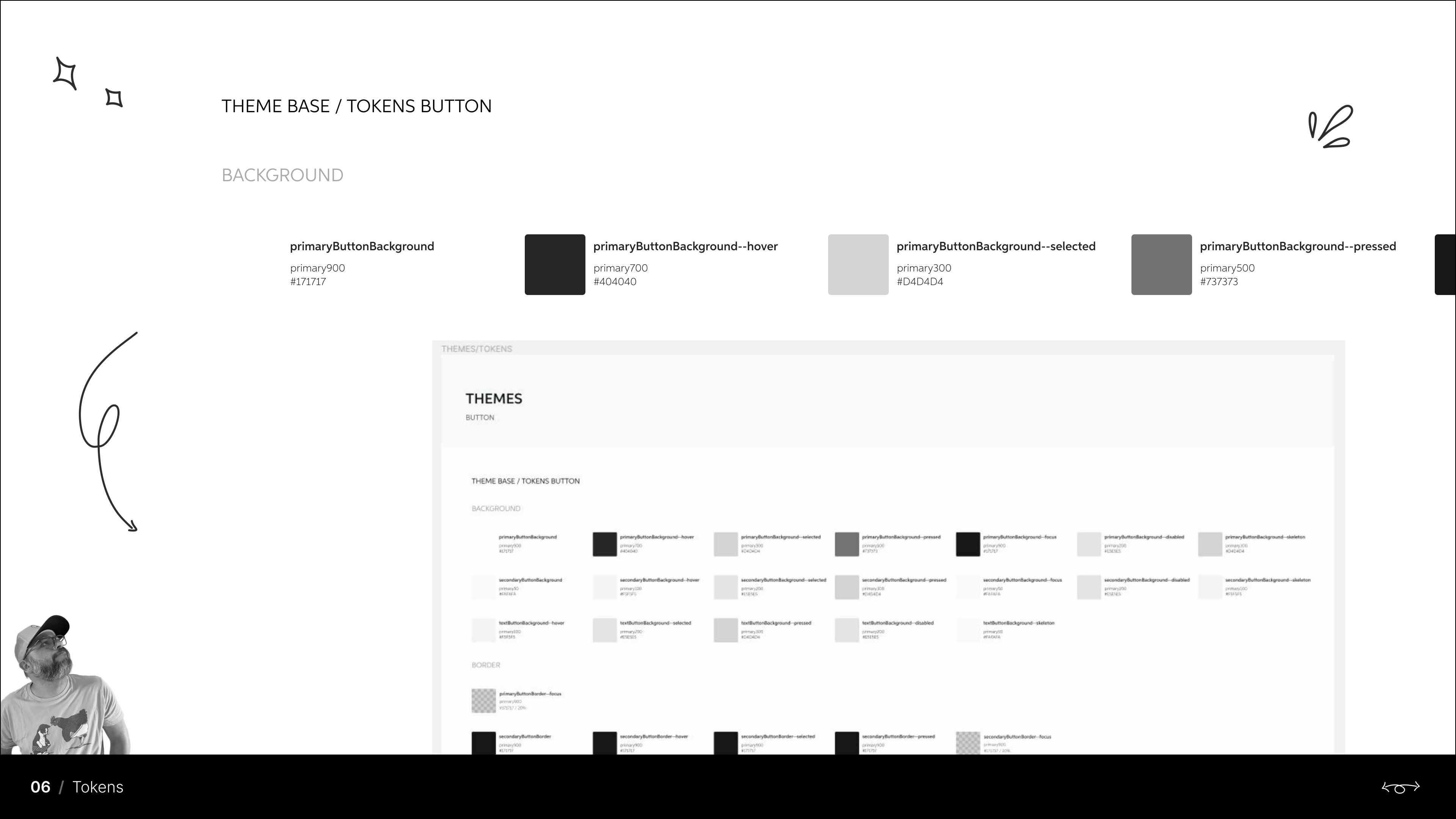
- Token-based theming — background, border and state tokens per theme (e.g.
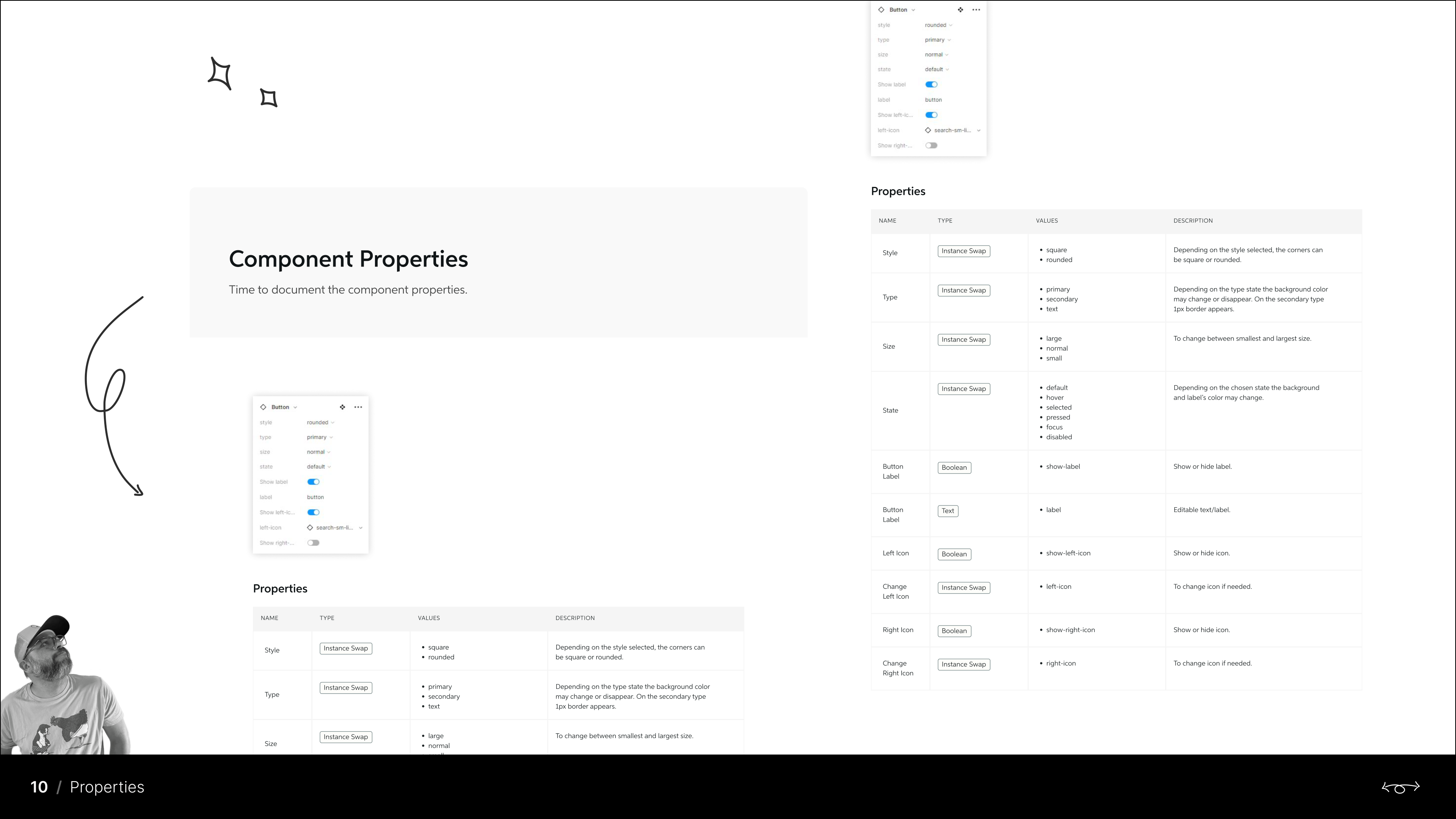
primaryButtonBackground--hover) - Full property documentation: style, type, size, state, label and icon controls
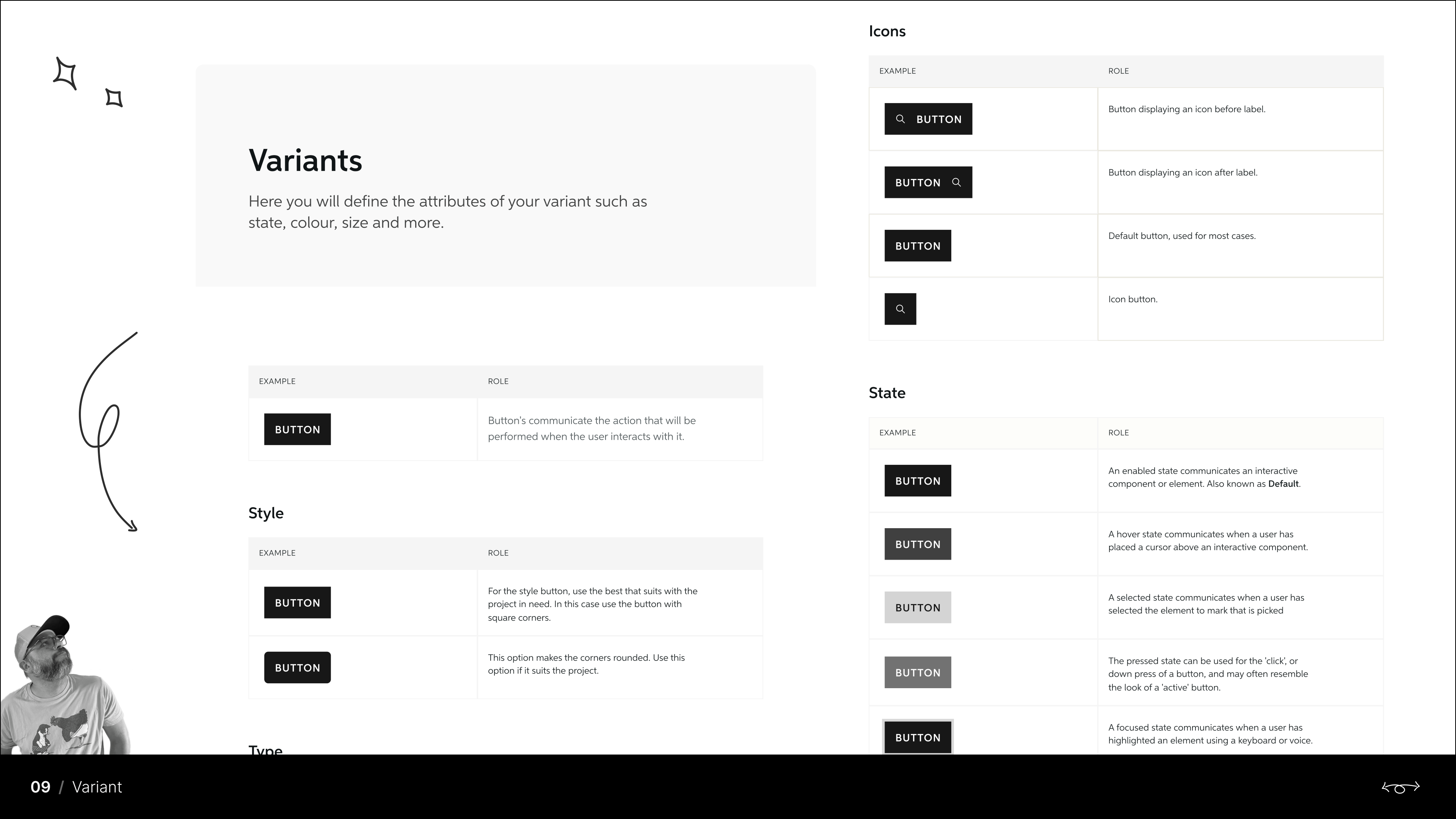
- Variant documentation with usage roles for every state
04 Governance & Versioning
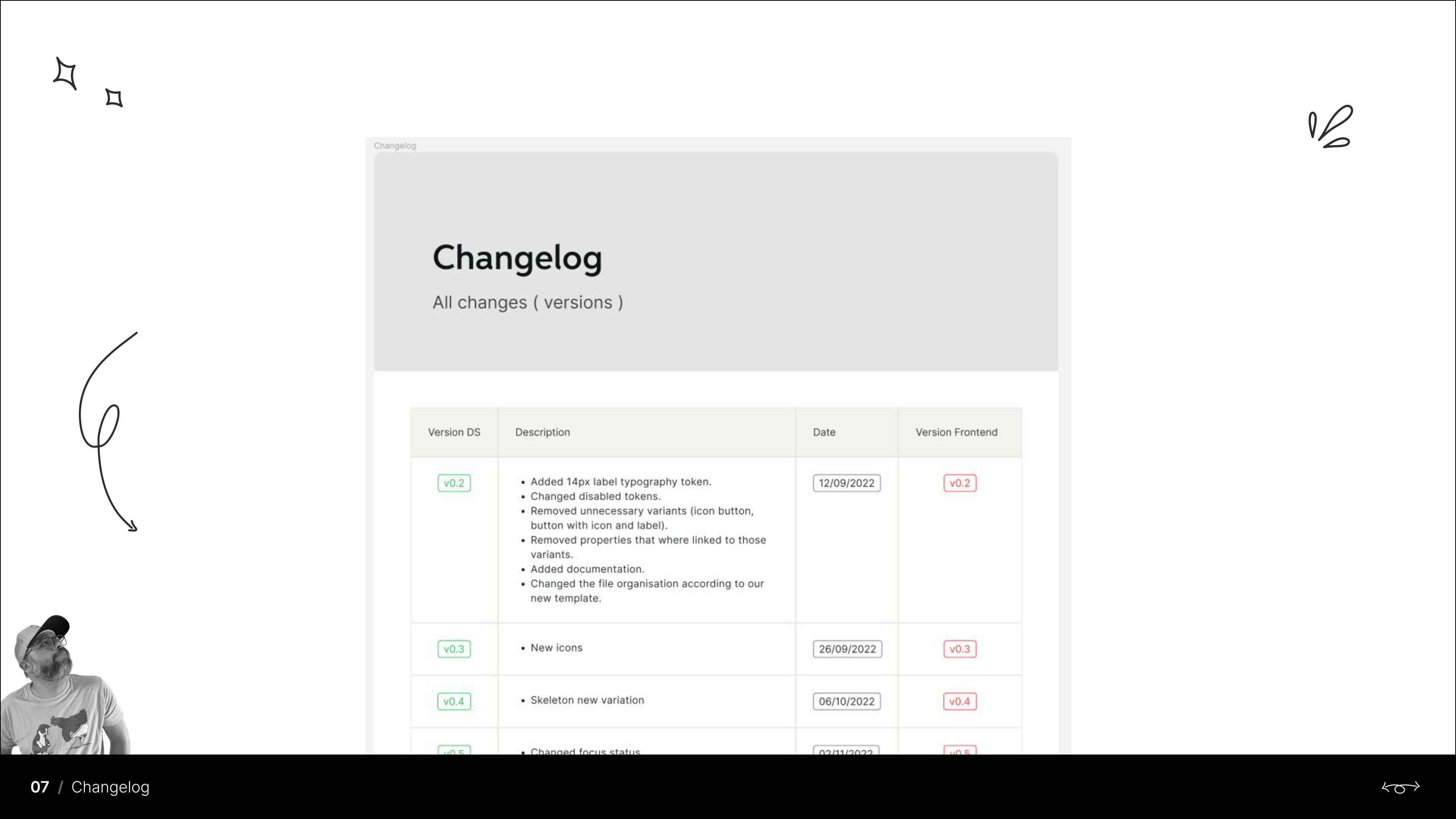
The system evolved through disciplined releases — a changelog tracks every design system version against its frontend counterpart, documenting added tokens, changed states, removed variants and reorganized files, keeping design and development in lockstep.
05 The Outcome
A comprehensive, navigable design system that became the backbone of Wella Digital's product design process — consistent components, token-driven theming ready for multi-brand use, and documentation that gives every designer and developer a single source of truth.