01 The Problem
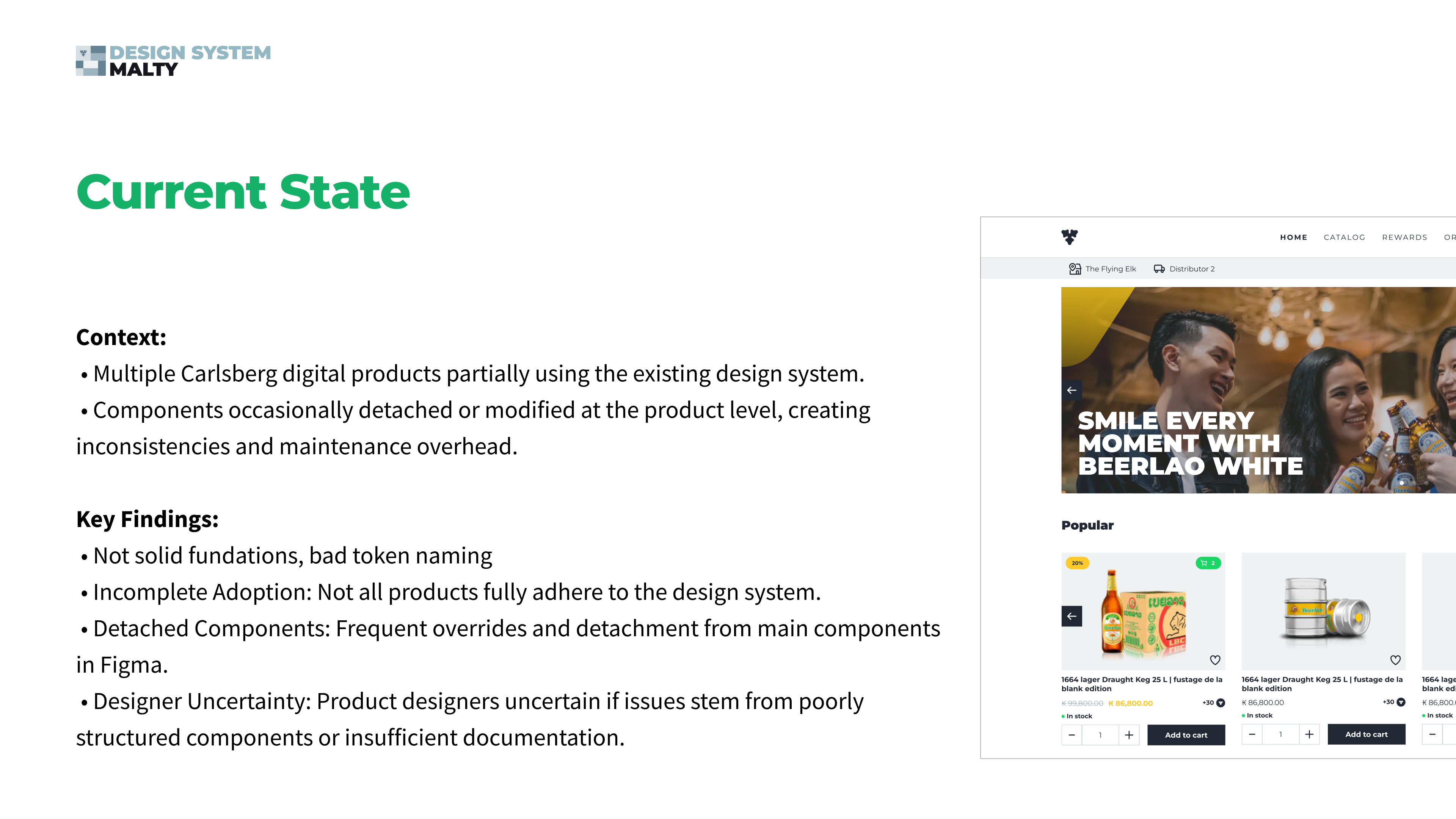
Multiple Carlsberg digital products were only partially using the existing design system. Components were frequently detached or modified at product level, creating inconsistencies and maintenance overhead across the portfolio.
- Weak foundations and poor token naming
- Incomplete adoption — not all products adhered to the design system
- Frequent component overrides and detachment in Figma
- Designers uncertain whether issues came from component structure or insufficient documentation
02 Audit & Research
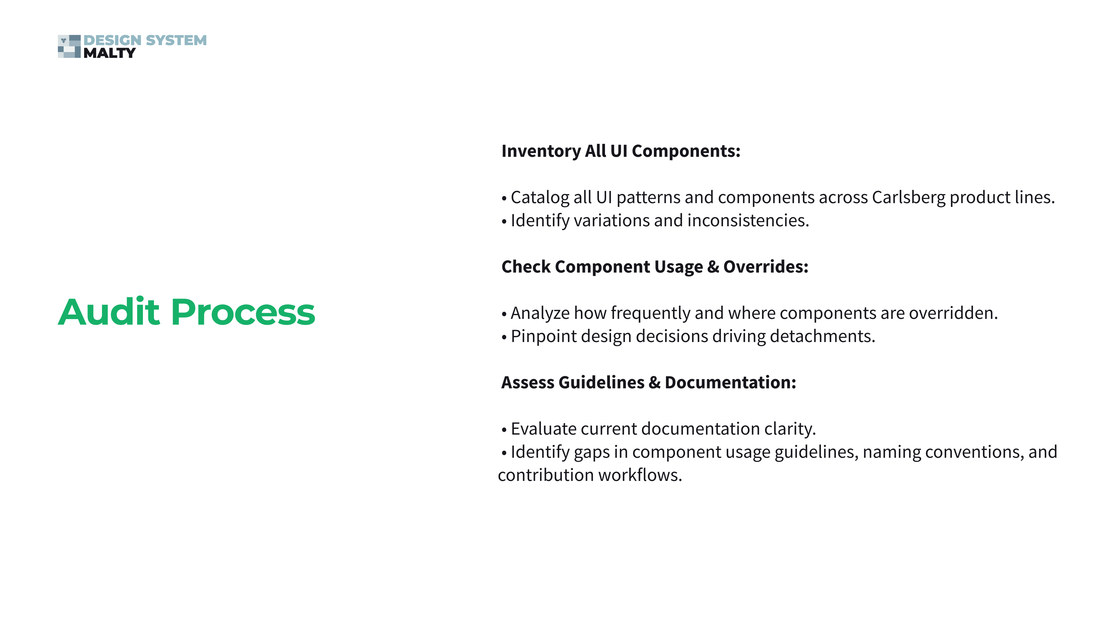
I ran a full inventory of UI patterns across Carlsberg product lines, analyzed component usage and override frequency to pinpoint the decisions driving detachments, and assessed the documentation for gaps in guidelines, naming conventions and contribution workflows.
To ground the findings in real workflows, I interviewed product designers and teams about adoption experience, usage barriers, scalability concerns, documentation quality and tooling — the root causes surfaced: inflexible component structures, documentation gaps, disconnected teams and limited communication channels.
03 Rebuilding the Foundations
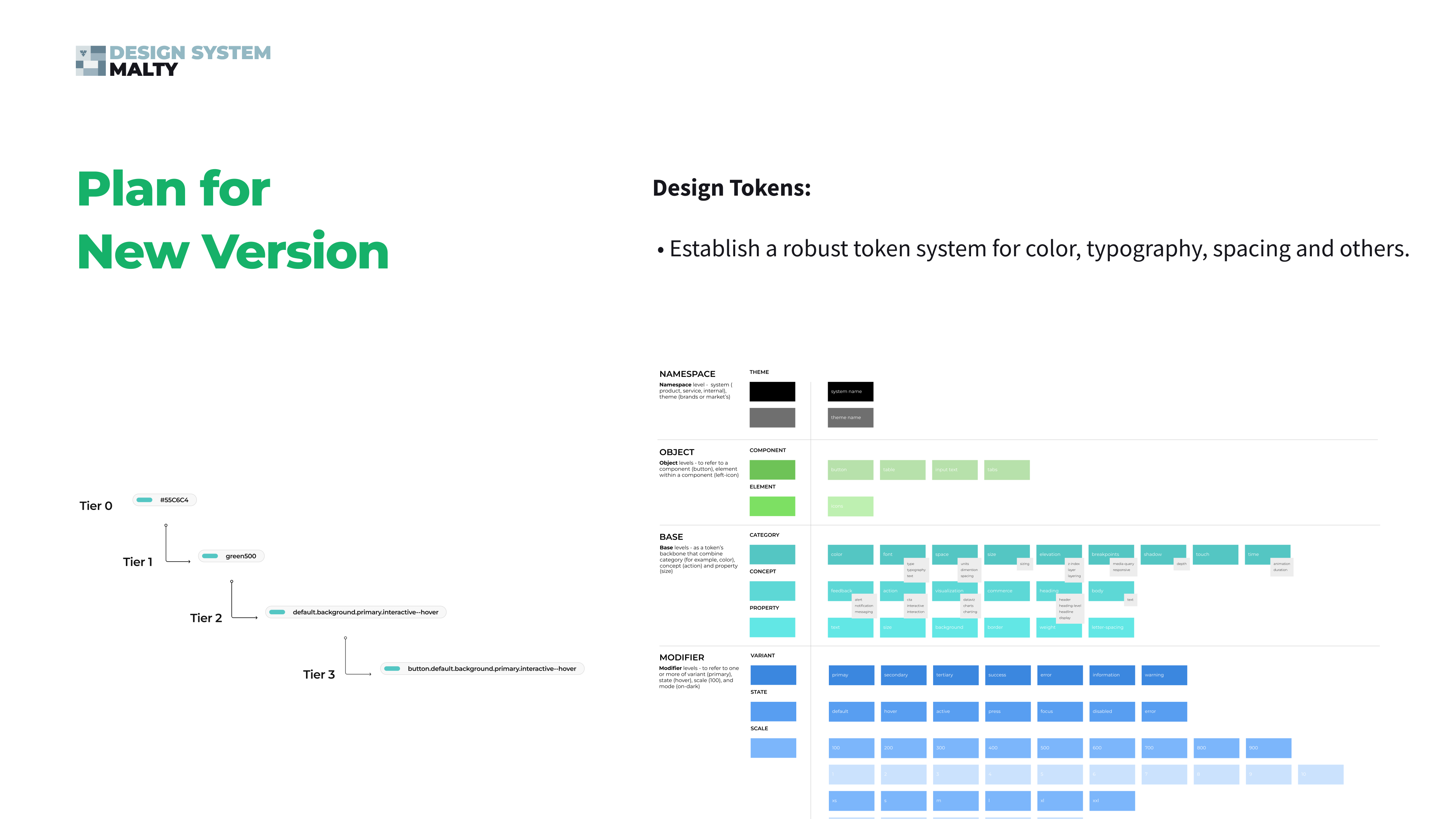
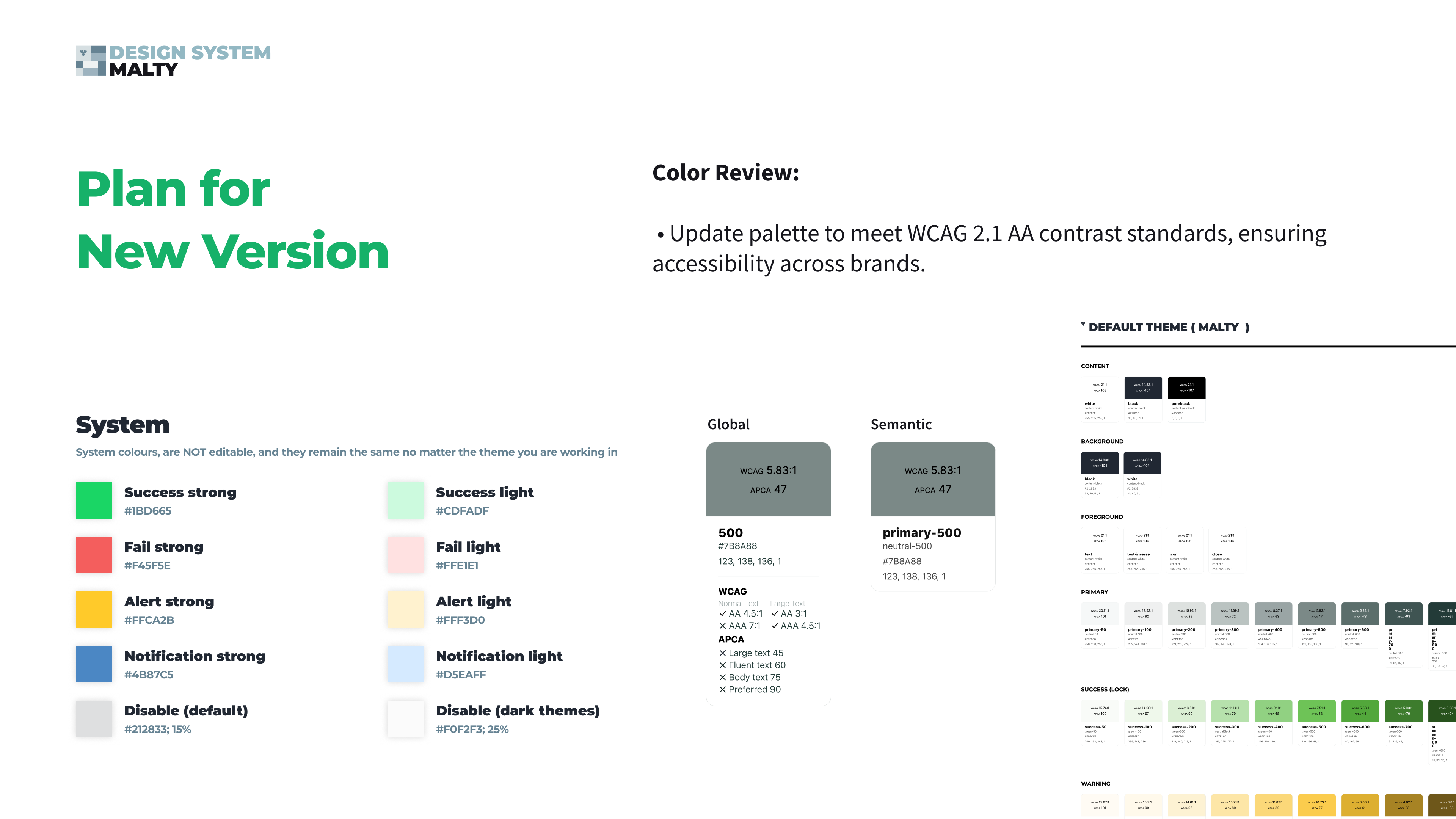
The new version started with a robust token architecture — namespace, object, base and modifier tiers — covering color, typography, spacing and beyond, with naming that matches from design to development.
- Four-tier token architecture: namespace (system/theme) → object (component/element) → base (category/concept/property) → modifier (variant/state/scale/mode)
- Color palette updated to meet WCAG 2.1 AA contrast standards (validated with WCAG and APCA ratios)
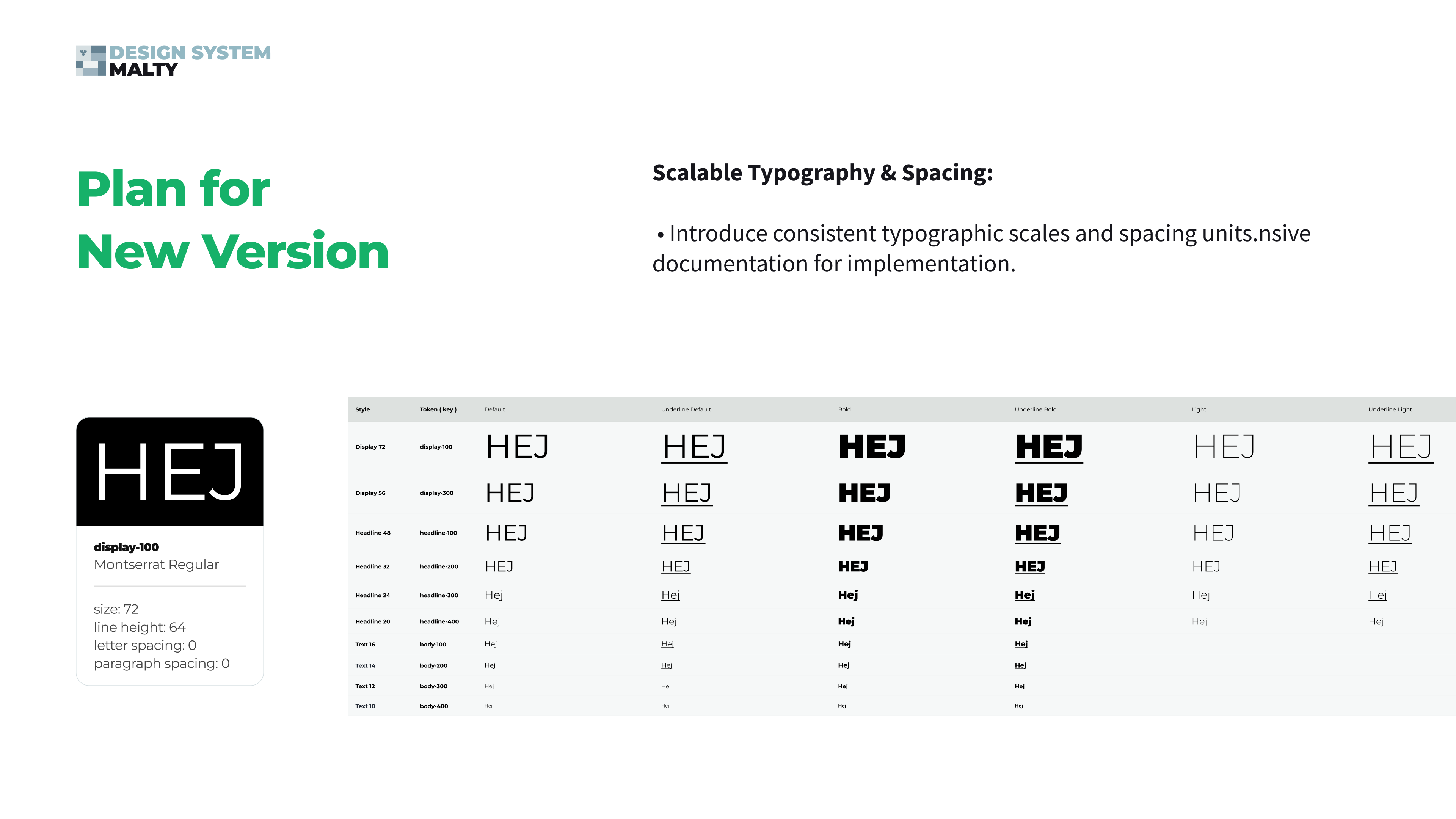
- Consistent typographic scale — from display-100 to body-400 — and spacing units
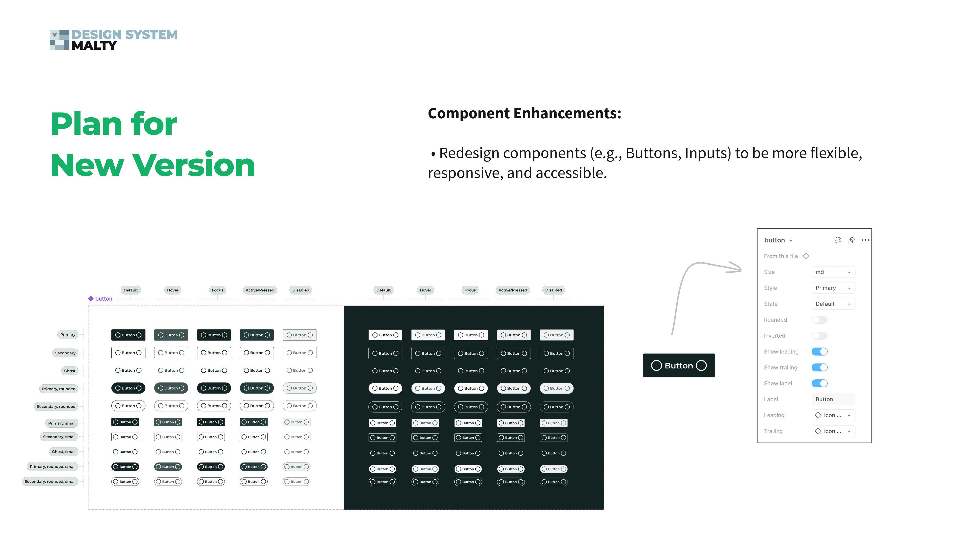
- Components redesigned for flexibility, responsiveness and accessibility
- Documentation migrated from Zeroheight to Supernova with clear dos/don'ts and contribution procedures
04 Multi-Brand Theming & Ways of Working
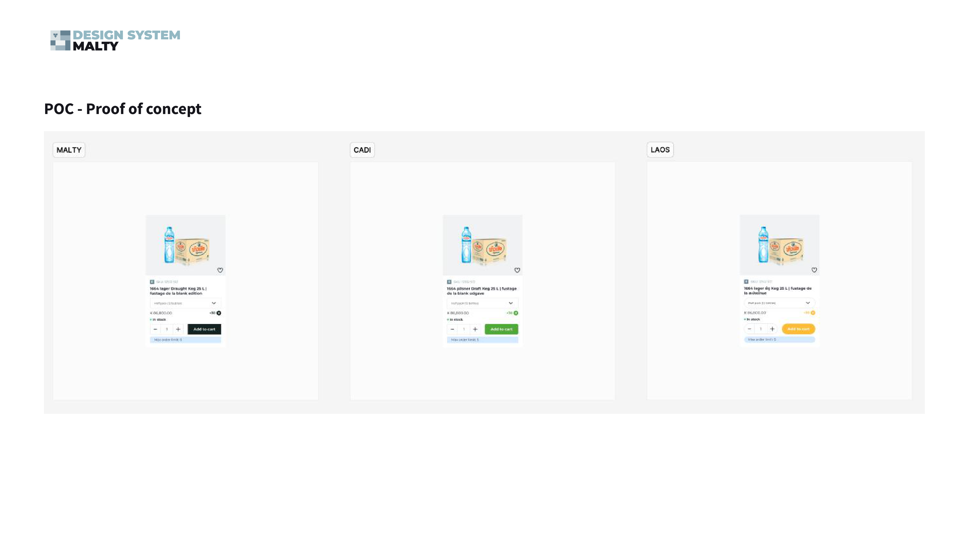
Figma variables handle branding differences — color, logo, typography — without duplicating components: a core library plus brand-specific variant libraries, a standardized file structure with naming conventions and versioning, and a Starter Kit for fast onboarding of new product teams, on both design and development sides.
To fix the communication gap, I created a Figma-based Design System Helpdesk plugin — a centralized feedback portal where designers ask questions, flag issues and request enhancements directly inside Figma, with changes broadcast to the whole team in real time.
05 Governance & Measurement
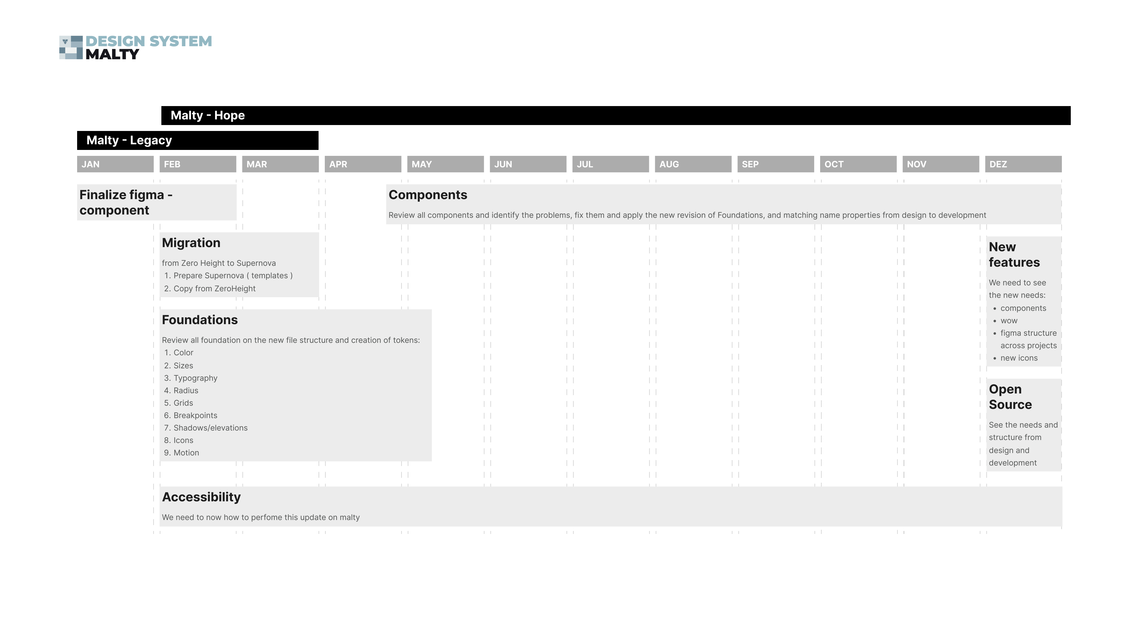
Adoption is measured, not assumed: plugin analytics track component usage and override frequency per product, monthly design system reviews keep a continuous feedback loop, and usage data drives the retirement or redesign of underused components. A 12-month roadmap phased the migration — foundations and tokens first, then component review, documentation migration and new features.
06 The Outcome
A new base to move forward — enhanced consistency and quality across all products, modern accessibility standards, reduced designer friction, and a foundation for sustainable growth, innovation and brand differentiation.